HOW VIBRANT SYNERGY FOUND ITS WAY TO REALIZATION
Journal / Strategic Insights / 14.12.16
PAVING THE WAY TO VIBRANT SYNERGY
To prove the essence and pure power of Vibrant Synergy, Mozaik members worked as an extended team of specialists to create the absolute expression of our philosophy and instill it to our rebranding. Our video and website are solid proof Vibrant Synergy works and is here to stay.

THE VIDEO. GREAT INSPIRATION LEADS TO GREAT WORK
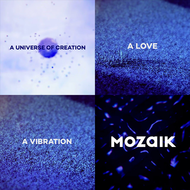
For the creation of the Mozaik video the original concept was conceived and developed by us to meaningfully explain to the user what we mean by the idea of Vibrant Synergy. Trout, the agency that undertook the fine job of executing the video based on our script and storyboard, fully understood us and managed to synchronize perfectly with us; proof that vibrant synergy is an achievement you can also realize with people outside your solid organism, when you aim at the same thing: perfection. The Trout team consisting of Andreas Helmis, George Kalofolias and George Mpaourdas worked strictly with code to produce the video inspired by the people of Mozaik. Alexandros Retsis beautifully composed an original score and there it was: the audiovisual interpretation of our philosophy in motion!

THE WEBSITE. THE ESSENCE OF SYNERGY
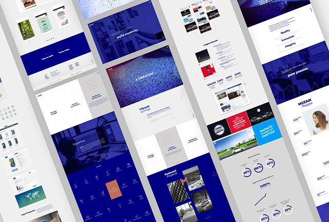
For the Mozaik team the challenge was to design and create a highly contemporary website that would work as a pole to existing and prospect clients in a new digital atmosphere and showcase the agency’s essence, potential and long-lasting success. Moreover, we wanted to create a distinctive character for the agency’s new era and draw users into the world of Vibrant Synergy.
The new, fully responsive website is based on minimal clean-cut lines, strong typography and vibrant aesthetics. The key inspiration was the cymatics and their interpretation first introduced to the user with the top-notch video based on this very idea.
The look and feel of the website corresponds and represents the agency’s quality in our digital universe. Blue is the dominant colour selected for the rebranding, to highlight the digital aspect of the core business while SVG animations on parallax movement are used to underline the idea of cymatics in the visual identity of the agency and the website itself.
The services overview was developed with canvas, where floating particles are interacting with the user to form cymatics’ patterns for each of the agency’s area of expertise. Getting into the Services page layouts the full spectrum of services is depicted with custom iconography, soon to be enriched with a more detailed description.
We also designed and developed a digital interactive mosaic to present the true essence of the Agency, its people. All 57 members are portrayed in a smart gif animation. As for our work, the enormous volume that comes with our 10 year presence had to be downsized into a portfolio showcasing an eclectic selection, to highlight the 360° approach of the agency.
Finally, the awards page features a floating menu for awarded projects. We have already some important wins in there and keep making the list bigger, our most recent award being one for the new website itself!
Our blog was also redesigned so as to be aligned with the new visual identity. We also renamed it by the name of “Journal”, so that our living organism’s activities, are vibrantly presented in each and every blogpost.

THE MORE “TECH-SAVVY” SIDE OF THE WEBSITE
Developing our rebranded website, we had to reinvent ourselves technologically as well.
The new design inspired the use of custom scripts for navigating and animating our site.
Working with canvas elements, for example, we managed to transfer our core principle of vibrant synergy into a playful animating section.
Using SVG, CSS and JavaScript frame animations, along with parallax scrolling, the vibrant feeling was spread through the site, from loading to inner navigation.
Asynchronous dynamic data loading, using ajax technology, was also used for fast, yet extremely smooth, page changing, even when loading big chunks of data, as in the case of showcasing Mozaik’s feature works.
For showcasing our videos, we used custom JavaScript control scripts, assisted by the Vimeo and YouTube player APIs in certain cases, to maintain top HD quality, without losing delivery speed.
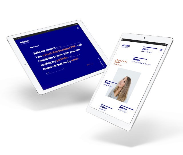
Moving to tablet and mobile, we managed not to lose any of the desktop version features. Although the use of fallback images was chosen, in favor of mobile data saving and loading speed, the main look and feel is still there, assisted by the presence of animated gifs giving us a final website that is truly responsive to all devices and screen sizes.
We had to push ourselves to new, undiscovered paths in the technology fields this time, following a demanding design, to end up with a great website, in all aspects, technology, usability, design. A vibrant website that can portray Mozaik’s ideas and principles, but also pushing us further, making us better in building websites for our clients. Website that don’t just follow the latest technology trends any more, but create them instead.

CSS DESIGN AWARDS – WEBSITE OF THE DAY!
On December 6, 2016 and having just a few days of online presence, our brand new website managed to get a great global distinction! It was nominated and won the WEBSITE OF THE DAY title at the CSS Design Awards. A great moment for us, for sure. We hope this website will give us more similar moments of pride in the months to come.
