RESPOND TO RESPONSIVE
Journal / Strategic Insights / 24.04.13
Responsive Web Design: the art of providing the best UX to multi-screen browsing.
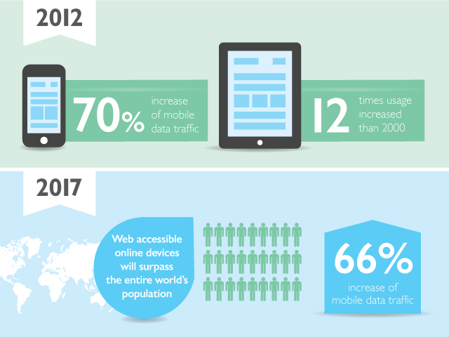
Inching closer to the multi-screen era, tablets and mobile phones are rapidly replacing computers and screen transition is becoming structure specific, increasing the need for adoptable layouts that are easily operable by all devices.
The continuous platform transitions have presented web agencies with a great challenge: “uniformity”, intriguing them to come up with a design that preserves the same format, content, features and applications and can dynamically adjust to fit any screen.
The truth is in the facts.

Powered for instant internet access on the go, at any time, from any place, Responsive Web Development responds and self-adjusts to fit any screen resolution providing easier navigation, customizing a uniform browsing experience across platforms.
Switching to Responsive Web Design evidently reduces the costs of developing and maintaining numerous “device-specific websites”, improves SEO through the lean and targeted content and minimizes browsing time, enhancing the overall user experience.
Through the intelligent use of media queries, developers have managed to target the default styles on devices by specifying screen width, resolution and orientation. RWD allows them to adopt these styles accordingly.
Looking more in depth into this breakthrough trend the highly skilled team of design, development and online marketing at Mozaik gives you an insight into the challenging aspects of Responsive Web Design.
Concerning the design process, Mozaik’s head of design, Mirto, goes over the basics.
Tips and challenges when designing a responsive website?
- Define your content: Prioritize your content and keep it in a well-defined grid.
- Reach the best UX: The main challenge is to find the perfect combination of usability and navigation without losing control of the basic website structure, form and function.
- Create within constraints: The designer must be aware of the limitations when designing, being certain that the site will fit in all resolutions or be confident to specify the site’s appearance in smaller resolutions.
- Less is more: The website needs to remain as light as possible without many graphics
- Extensive web font kits: Kits from font services can quickly escalate in size as you add more character sets. Bold and italics have different character sets so this will have to be kept in mind.
- Banners : Banners are a big subject in Responsive Design as well since they cannot have the same size among screens and moreover the same position.
- Make sure its “tappable”! Don’t forget you also design for smartphones and tablets
- Use icons in .svg format: They are easily resizable and they don’t lose their sharpness.
Our expert web developer Mayra will demonstrate some of the features employed in the development of a responsive website.

Which are the technical requirements of a responsive website?
- CSS: Responsive Website is built by using CSS Media Queries. This means that the CSS itself handles the layout of the website as well as the way it will adapt in order to support any device. In other words, the developer can set the screen resolution breakpoints where the CSS will change the layout of the site.
- Server-side “dynamic CSS” Responsive web design with server side components takes things one step further leading to website optimization regarding loading time & performance. This can be accomplished by using: a) Server-side “dynamic CSS” implementation of stylesheet languages like Sass or Less or b) Ajax through which you can serve different content or variants of the page while loading the appropriate content.
- Good practice: A good practice calls for page element sizing to be in relative units like percentages or ems, rather than absolute units like pixels.
- Resizing: The developer must also keep in mind that images have to be resized in order to appear correctly in the website.
- JavaScript frameworks: Prefer using JavaScript frameworks like Modernizr, which detects the supported features of the browser and makes it easier to have fallbacks or set different scenarios when a method is not supported by the user’s device.
- Time Optimization: The developer must always take actions to minimize loading time so as not to waste bandwidth with regards to website performance.
Online Marketing Director, Dimitris, shares with us his insight in sales and marketing as they pertain to RWD.
What are the benefits of RWD and how does it affect the sales strategy of a business?
- RWD is a whole new way of thinking. It is not a device-oriented approach but instead it is user-oriented. It makes it easy to process content in multiple device types and window sizes even if browsers and devices are radically different. It also enables website owners to focus their efforts on delivering great content and analyzing onsite behavior of all users at once instead of managing two versions of the website.
- Since micro transactions and impulse buying are activities flirting with mobile devices every hour of the day I believe that an RWD website directly affects the buying process as the owner is enabled to be flexible on smart deals and frequent updates on the content. Moreover, a “one-version-only” website pulls together the traffic data from mobile & desktop visitors as a whole, allowing a deeper conversion optimization and understanding of user’s behaviour.
- We are witnessing a remarkable shift from desktop to mobile search – at least for specific markets – and it is clear that mobile is about to become the main internet access tool as smartphones and tablets are overtaking desktops. It is true that Responsive Design is a Search Engine friendly approach and can improve visibility in search engines, following Google’s viewpoint that user experience is top priority. Consequently a great user experience equals high ranking possibilities. Furthermore, all SEO signals from links and social sharing are being attached to the website’s single URL.

Our team’s expertise, experience and on-going research is central to the way Mozaik does business and will help you take yours to the next level.
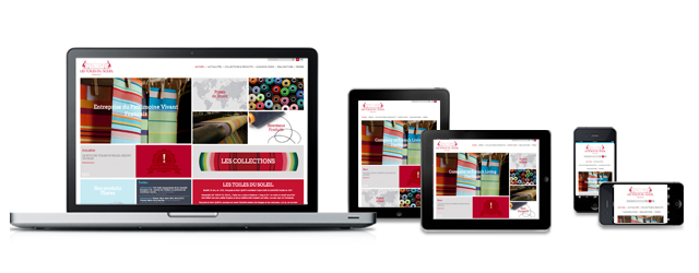
Mozaik breaks new ground and sets the trends. An apt example of our commitment to success is “Les Toiles du Soleil” website, a fully Responsive Website supporting fluidly all screen resolutions including multiple advanced and dynamic functionalities, for which Mozaik was honoured with an Ebge Award.
Moving deeper into the multi-screen reality Mozaik has what it takes to drive success through innovation.
We’ve gone responsive! Will you?
Be responsive, contact Mozaik, get a quote and let us guide you ahead of this trend!
