"A LIVE AIRPORT" CONCEPTION & DEVELOPMENT BY MOZAIK
Journal / Our Work / 15.07.13
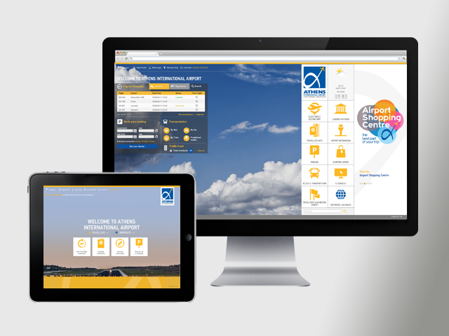
Athens International Airport ‘Eleftherios Venizelos’ released a brand-new website offering a ground breaking digital experience to its visitors. Only five months ago and following a competition, Mozaik was designated to deliver the new website of the airport that would stand out on a global level, from design conception to front-end development.
The website objectives:
1. Empower Brand Image
2. Enhance e-airport experience – inviting & joyful
3. Establish friendship & extent site ‘surfing’ time
4. Promote Destination Athens, Greece
5. Target and Navigate Right Person to Right Info at the Right Place
6. Increase commercial opportunities and leads
The starting point for our team was the definition of project’s requirements and objectives along with an in depth market analysis that would reach specific conclusions and lead to innovative conception.
The main challenge to overcome was to turn informative, practical and technical information into an unique online experience. The strategic vision was to set Athens International Airport new website as Greece’s digital traveling gateway, for business or leisure.
The 5 main aspects of the design strategic approach were:
1. Achieve Differentiation
2. Enhance User Experience & Familiarization
3. Create emotions
4. Projection of Athens, Greece Destination
5. Remain Informational & Trustworthy

The concept
The design concept “A-Live Airport” focuses on converting user needs to user experiences with the utilization of interactive ideas combined with ergonomic solutions. The airport does not simply constitute a complex of awarded internal infrastructures; it is a living entity – a gate – the actual starting and last point of travelers to/ from Athens, Greece. The starting point signifies a warm welcome of an unforgettable traveling experience while the last point is the moment when experiences turn into memories to share and communicate with others.
The website’s goal, for the thousands of AIA passengers and visitors, is to establish a steady digital experience that is the reflection of the actual experience: the airport is a place rich in moments and stories and a snapshot of the Hellenic culture.
Our inspiration
The airport’s prerequisite was a complete rebirth of their online presence.
This request became our inspiration and a great opportunity to conceive, design and develop a leading, cutting-edge website that would be both genuine to the Greek culture and convenient for the user.
Our goal was to create a professional,impressive and straightforward website that would be cool and user-friendly, both inspiring and original. The integration of responsive elements and the fluidity of the site would be flawless, tech-savvy and trust-worthy in order to create a pure feeling of relaxation during the entire visit session.
From design conception to execution, our contemporary approach was inspired by tablet and smartphones touch devices.
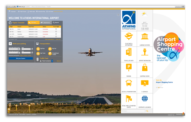
Athens International Airport corporate identity was integrated thorough with clean-cut and minimal design. From colors to typography and iconography, our objective was to deliver a truly original and dynamic website.
We used PF Din Text Condensed Pro, a prestigious and concrete font, both well designed and friendly to an international audience. Furthermore the 150 tailor-made pictograms displayed throughout the website considerably enhanced the visual impact and brand consistency, while ensuring a fast loading, all devices compatible website.
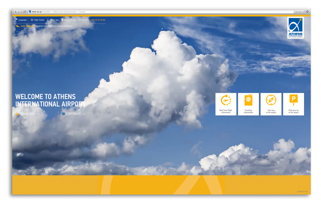
The website splits its target visitors into “Travelers” and “Corporate”. When first entering the website, the visitor must select the type of content he will be presented. A specific CSS customization in term of colors has been developed for the specific purpose.
The welcome page captures visitors’ attention offering a great visual presentation of videos revealing scenes of airport day life and Athens beauty landmarks. The videos create a playful yet powerful emotional impact blending concepts of time, travel, and discovery while the timelapse video technique reflects the dynamism and constant changing life of the airport.
The videos will alter throughout seasons to reinforce interactivity but more importantly to associate, involve and engage visitors by announcing upcoming Athens city news and events.
The front-end development analysis
For this project, the technologies used at a glance are:
– HTML5 & CSS3 with limitation in use of JavaScript as much as possible to make the site load faster
– Jquery
– Webfont (custom fonts) instead of images (symbols)
– Responsive design
– Raphael.js that produces SVG, used for the direct flights maps
– Google maps API for the maps (eg traffic feed) color customized
– Printable version by use of CSS
The website is compatible with IE7, IE8, IE9, Firefox, Safari, Chrome and Opera browsers for a minimum of 980 pixels for all common screen resolutions.

Mozaik / Our Design & Front-end Development Teams state the 6core design challenges
Intro page: During the initial project briefing, the initial requirement to conceive an intro page seemed as a great challenge for our team. Intro pages are considered outdated.Few weeks later, the so-called obstacle became a source of inspiration for the creation of an original and superb concept. The intro page was turned into a fully functional welcome page introducing the new digital presence and enabling users to reach at once the most important information offered in the website while establishing AIA’s vision as a traveling and business gateway promoting Greece’s position as an exceptional destination.
Resizable website with minimum scrolls: The main challenge was to make a site that was resizable & responsive at the same time, while remaining loyal to design specifications. To solve this we had to make intensive tests & trials to come to the desired result to support all browsers. We used the principles of Responsive design & CSS Media Queries so that the site can be viewed from the 1024 x 768 dimension (iPad) and above.
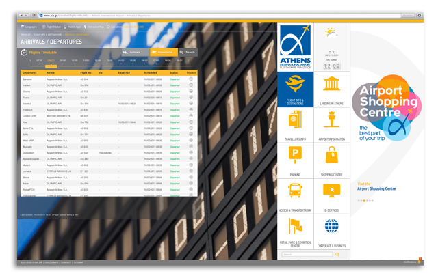
Pictograms & Navigation: Due to the fact that the site has many graphics & symbols (images) there was a significant possibility to face loading issues. We used a custom webfont and created more than 150 tailored pictograms so that the site loads faster. By using this, we also got the ability to add more animations (hover effects) without overloading the site with images or a sprite image with far too many images within it.
Design wise the reason behind this initiation was to establish a global visual navigation language for the new website that clearly divides and guides users to the various thematic sections. Moving a step forward the Quick links and an expandable sitemap adds to this logic & contributes to the ease of navigation required.

How to handle so much information without losing design quality. AIA.gr is definitely a «heavy» information website and requires a minimal and straightforward approach regarding the use of graphics, typography, colors, icons and different UI styles. A minimal and clean-cut approach with emphasis on information and usability were the core elements of the design.
Moreover the design has to «educate» the user how to reach all information and access different areas and thematic without being chaotic or misleading. The design not only guides the user in an inviting way to the information required but also intrigues him for further navigation.
Advertising space: The commercial enhancement was a requirement. However we had to be in line with the design character of the website. The banner/advertising area is designed to accommodate customized advertisements that are able to provide the message to the user directly but not to undermine the navigation or the aesthetics of the overall experience. They should grab the user’s attention but not actually distract him.
Data Implementation: The produced result (front-end website) should be implemented to an already established content management system by Greek Geeks who has already developed the back end of the website .The front-end development outcome had to be delivered early enough and ensure a high quality while being clear and specific to facilitate the implementation.

The next day of a fruitful collaboration
The website constitutes the starting point of a successful collaboration which defines as next steps: the HTML5 Interactive maps, Info Kiosks and Mobile Application. Stay on board to discover more!
The website’s project at a glance
- Deliverables: Website Design & Front-End development
- Project Duration: 4 months
- The strategic approach: From User Need to User Experience
- The concept: A-live Airport
- The outcome: A touch challenge that evolved into a ground-breaking venture
